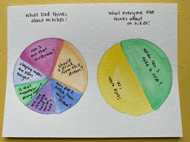
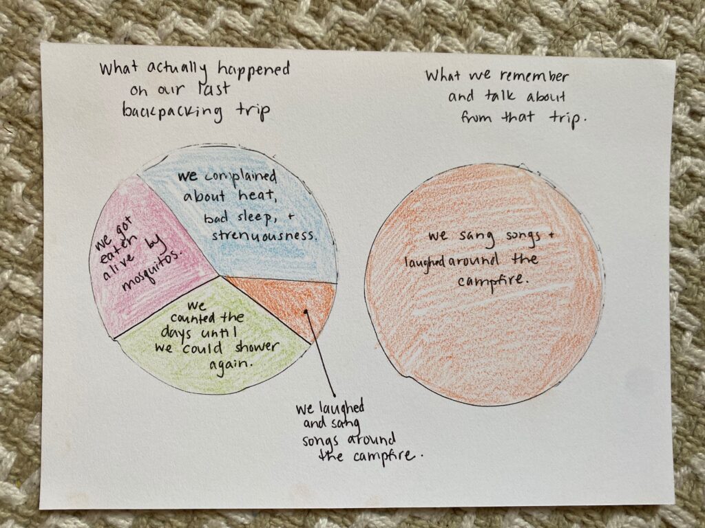
Call me your fifth grade math teacher, but I’ve been on a pie chart kick lately. It started when my husband and I were goofing around with watercolors a few weeks ago (the pandemic may be winding down, but we have a toddler and baby, so at-home date nights are our destiny), and we jokingly started making pie charts depicting family memories.
For instance, “What actually happened on our last family backpacking trip vs. What we remember and talk about from the backpacking trip.”
I soon realized that what started as a humorous endeavor can be more than a source of fun; pie charts can also be a tool to instigate self-improvement. With some introspection and a few colored pencils, we can use pie charts to depict where we are versus where we want to be.
For instance, “How I spend my free time vs. How I wish I spent my free time.”
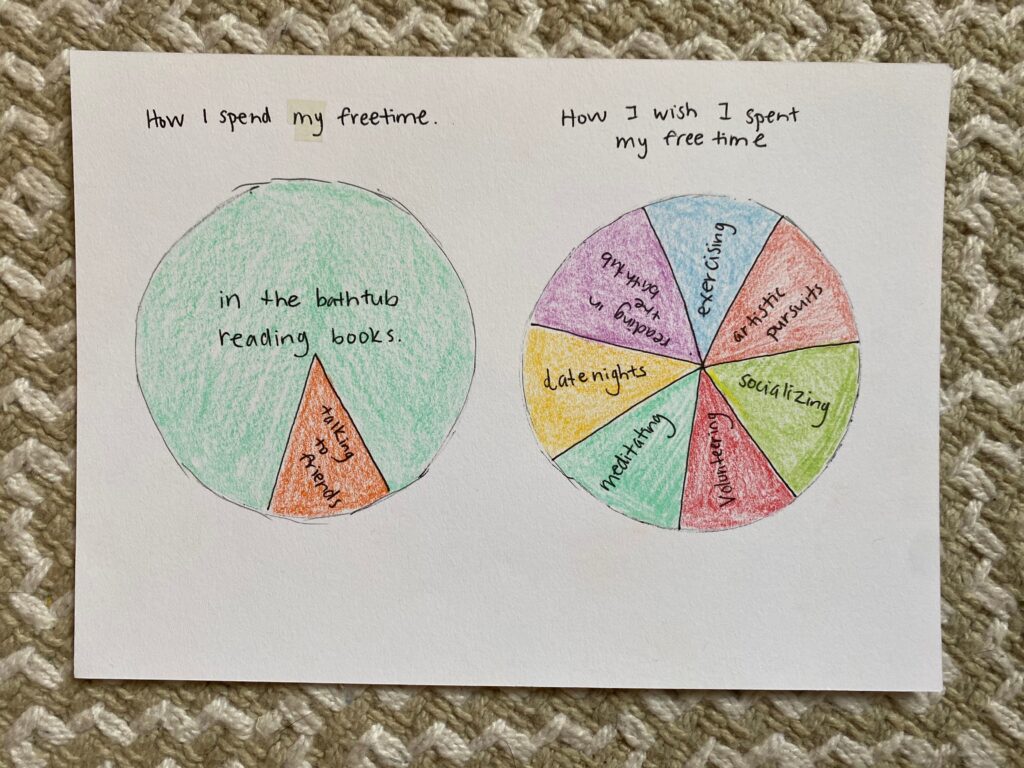
Visualizing the difference between our current and our desired states can serve as both a motivation to shift our behavior and a road map for getting to the new place. There’s nothing like reflecting on my previous week while I drew my pie chart and seeing that I spent a total of eight hours in the bathtub reading to a) make me realize that I actually have ample free time, and b) inspire me to use that free time for other good causes.
RELATED: Post-it Planning: How to Stay Productive and Present This Week
It’s not that soaking in the tub is a bad use of time per se, especially considering how much reading I get done in there (five stars for my waterproof kindle). But there are so many other things I’d like to be doing as well, and the pie chart visual helped me to see that I could still have a healthy dose of tub time while also making space for exercising and journaling. Who’d have thought?
The same idea applies to “What I typically cook for dinner vs. What I wish I was cooking for dinner.”
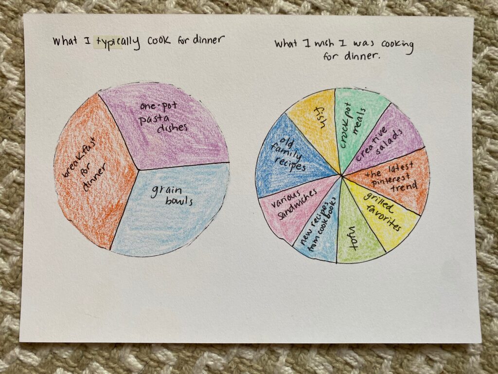
Breakfast-for-dinner, one-pot pasta dishes, and grain bowls are economical, healthy and delicious choices. But is there more to my culinary capabilities than these three categories would lead you to believe? Yes, yes there is. My pie charts inspired me to expand my meal repertoire, which I’m doing through a more concentrated effort at meal planning. This week’s menu includes zucchini boats, veggie and hummus wraps (and I’m even making my own hummus!), and cobb salad.
My charts got more serious when I decided to take a closer look at my reading choices. What I saw when I examined “What I’m actually reading vs. What I’d like to be reading” wasn’t pretty.
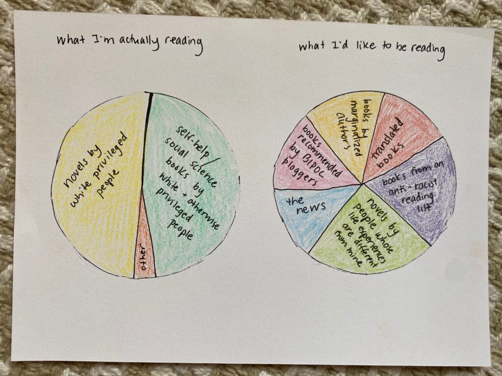
There are a lot of great books out there written by white, privileged authors. But there are also a lot of great books written by BIPOC (black indigenous people of color) folks and people whose voices have been historically (and currently!) silenced. By unthinkingly ignoring the latter, I contribute to a society plagued by white supremacy and anti-Black racism — oppression that I want no part of.
My pie charts helped me see that I can do better, and I’m committing to expanding my reading horizons.
Becoming better versions of ourselves — learning more, growing kinder and stronger, expanding our perspectives — is hard work that takes introspection, honesty and discipline. Pie charts are a fun way to guide yourself on the journey…and to make it a little more colorful along the way!
Originally published in July 12, 2021.